


Corporate logo
The Irdeto and Denuvo logo is our key visual symbol that identifies the company and reinforces its name. It is to be placed on all communication materials, internally and externally. It can be used in the ways presented on this page.

Usage
The Irdeto and Denuvo logo is available for use as follows:
-
Original color logo on light background
-
White logo on dark or colored background

Other variants are not permitted
(without permission from the Irdeto Marketing team)
- Do not distort or stretch logo
- Do not alter the coloration of the logo
- Do not use logo without all elements of the logo
- Do not create an outline around the logo
- Do not alter the position of elements
- Do not add a drop shadow or any other effect to the logo

Dimensions
The minimum amount of clear space around our corporate logo should always be half the height of the logo. If the logo height is 200px, then the clear space around the logo should be 100px. Visually, this can be calculated by ensuring the space around the logo is at least half the height of the tallest letters – “i,” “d” or “t.”

Corporate colors
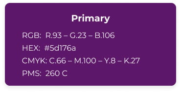
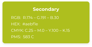
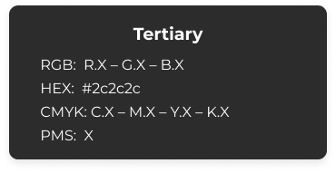
Consistent color usage is integral to the integrity of the Irdeto brand. For printing, when Pantone colors can be specified, use Pantone (PMS) 260 and Pantone (PMS) 583 C, when Pantone colors cannot be specified, use the four-color (CMYK) process equivalents provided.
Corporate font
The font Montserrat is used on the corporate website and in all graphical and marketing-produced materials, and was chosen for its modern look and versatility.

/Images/Module%20-%20footer/spiral.svg)


